
Type Of Project:
Creative Direction / Co-Founder
Period:
October 24, 2021
Status:
Ongoing Work
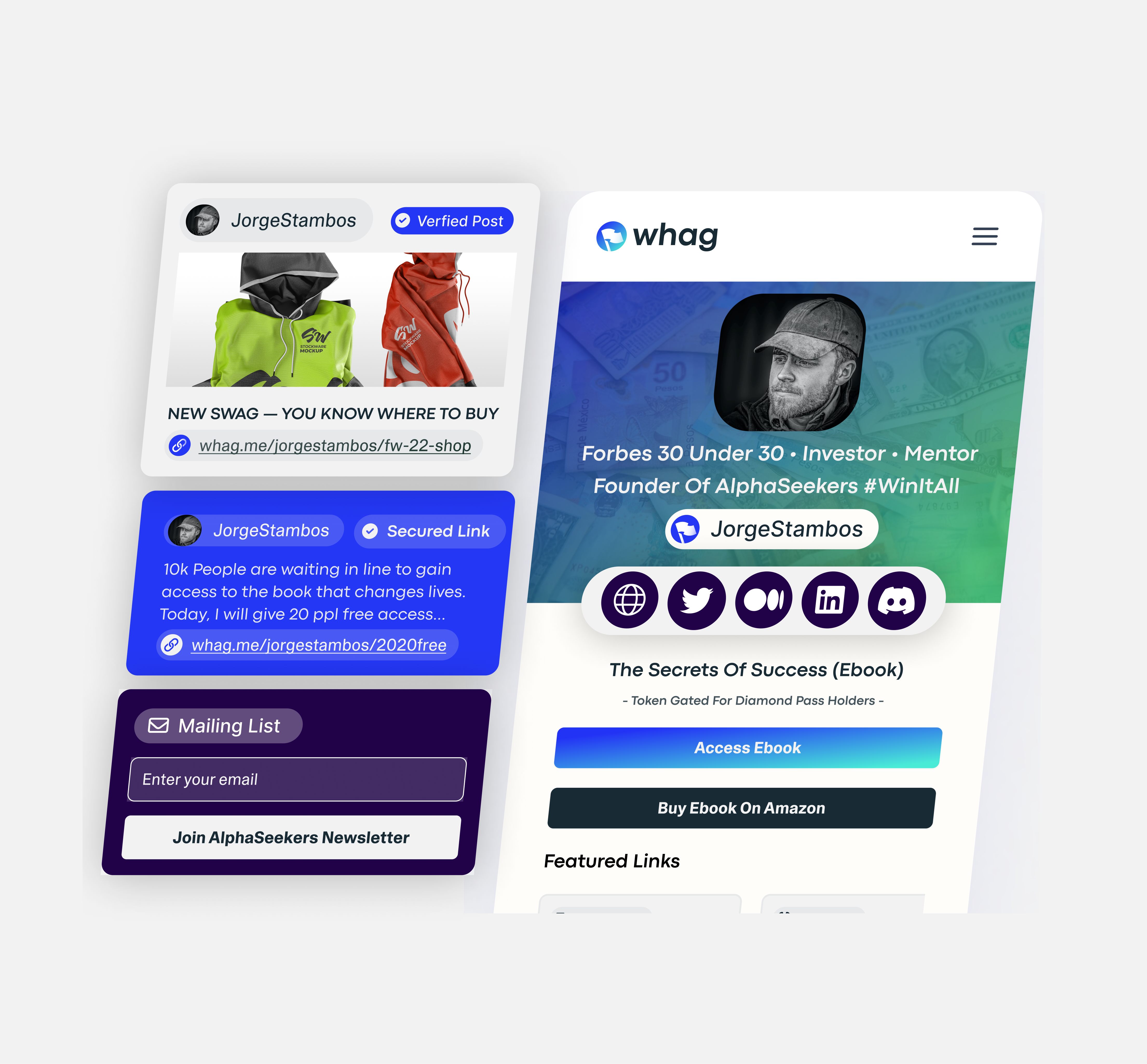
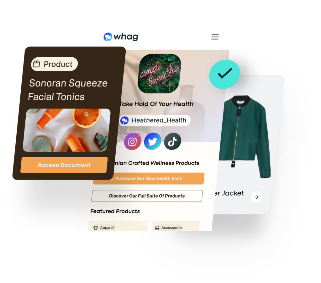
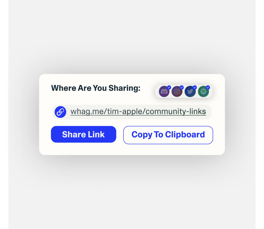
Whag is a security focussed, centralized informational hub designed to facilitate distribution of core knowledge across digitally native communities.
Introduction:
My business partner Sebastian and I created Whag to help decentralized groups build centralized knowledge bases and share information with their communities in a secure, verifiable manner. We created Whag because in crypto and web3; phishing is becoming a critical point of failure within most projects and it comes down to links.
Background:
My initial idea was to create an application that would allow seamless onboarding for NFT communities, I saw that there was a huge gap to be filled with the post-purchase funnel involved with NFT communities.
Most communities have their members buy these 'utility' NFTs and after they purchase the NFT, often, holders have to go on a quest to across the web to find the various fractured parts of the community they just joined. Queue, Pitstop (The First Incarnation Of Whag)
We went through the 3D Branding process to craft the Pitstop brand however as we developed the product we noticed that the real opportunity is within the links and being a a tool that integrates with other tools rather than engineered new behavior patterns. Upon realizing this new approach is valuable we rebranded the nascent PitStop into Whag.
Rebranding Pitstop Into Whag.
Whag is short for Whaagan a Jamaican colloquialism used to greet others, W.H.A.G is also great because it works as a backronym for where humans are going.
Developing The Art Direction For Whag
Whag is meant to appeal to both Web3 and Web2 users, it needed to be both human and inviting, user friendly and have that glossy web2 startup look and feel.
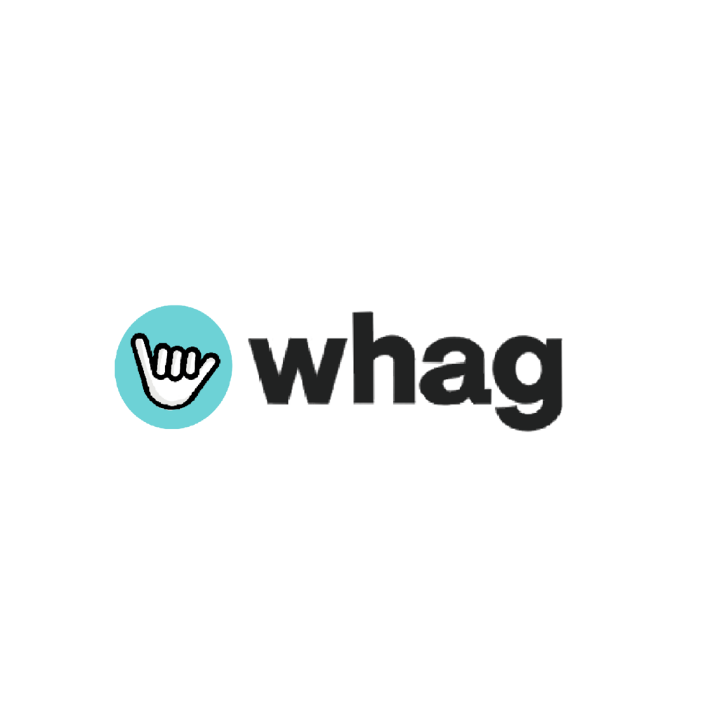
The Whag Logo
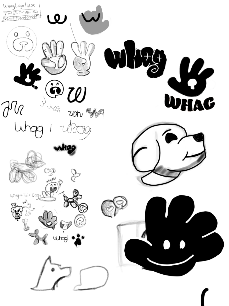
Immediately my mind went to imagery like a handshake, shakas, and a dog, they are friendly and approachable and convey an openness about them. However, they were missing the mark and the symbolism was a little too much on the nose. Stuck, I kept sketching and ideating until the current logo came to mind the flag.
You plant a flag to let other know that the area is marked, either you summited a mountain, staking your territory, bringing notice to a particular area or more. The flag fit perfectly with the brand vision of Whag. The first iteration of the flag logo had this flat, two-tone, visual treatment. It looked cool but the color coordination was tricky and it looked cheap. The final iteration of the logo was a solid flag mark with improved geometry that looks so very clean.

Typography
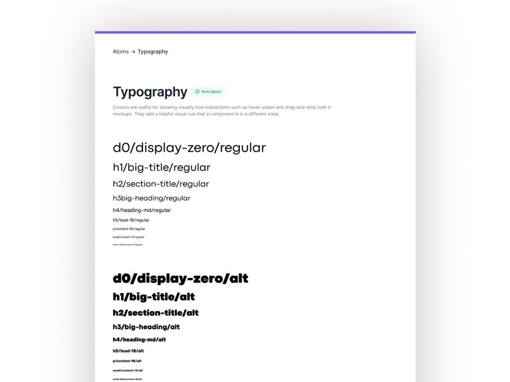
One of my favorite parts of crafting a brand identity is choosing the right typography. Since Whag is a Web2 SAAS product naturally I leaned towards a neo-grotesque sans-serif typeface. I like to pick two typefaces: brand and body, the brand typeface is used in the wordmark and it's the workhorse of the identity. The brand typeface for Whag was challenging to find because of the unique geometry of the logomark, it has sharp angles and curves, is short but also wide.
I knew that I needed to choose a typeface that has a narrow and almost uniform x-height, it needed to have a variety of weights, but the weights needed to scale very linearly, and it needed geometric letterforms with some harmony across the character widths.
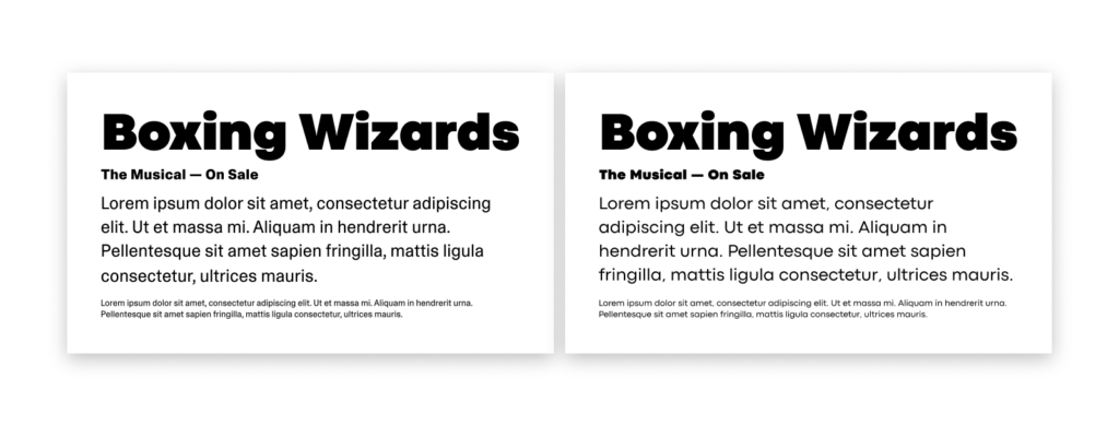
Why I Chose Codec Pro
It's Flexible And Offers A Wide Swath Of Customizations
Codec Pro includes a wide range of glyph alternates and stylistic sets that cover all the subfamilies and the moods of the original type system.
It Geometric Yet Has Some Character And Funk
Codec Pro has terminals cut parallel or perpendicular to the baseline, emphasizing geometry for a more constructed look, the typeface really comes alive with it's funky ligatures and not also perfect construction of its letterforms.
Pairing Codec Pro With ABC Camera Pro
I could and will write a blog post on the scientific and anecdotal reasons geo sans typefaces sucks for content, but for the purpose of this article let's get back on track.
The strength of Codec as a headline and display typeface is also its weakness in small scale and for long form content. Personally, I'm not a fan of using geo-grot fonts for long form content, the characteristics that make them so juicy sized up are the exact reasons they shouldn't extend below the first few headings.
Whag needs a versatile typeface for communication that's readable, visually appealing, and fits well within the brand's identity; Camera Plain checks all the boxes. Camera is a variable typeface from Dinamo Typefaces (on of my favs)

No comments.