It's Story Time, This Is A Visual Case Study About:
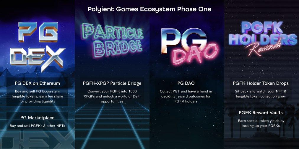
Polyient Games Founders Key:
Designing The Look And Feel Of The Very First Ultility NFT Ecosystem.
Financial Success:
$10 Million + In Primary Sales
~ $1 Million In Secondary Sales
Crowd Pleaser:
10k Twitter Followers
Multiple Tier One Publications
Trailblazer:
First Utility NFT
First Liquid Staking NFT
Project Introduction
As Creative Director of Polyient Games, I was instrumental in the success of the Polyient Games Founders Key ecosystem.
The PGFK is a first of its kind in many ways—however the real call to fame for these tokens are that they laid the foundation for modern ultility NFTs and their respective token ecosytems and economies.
We launched the PGFK in Fall of 2020 a time where the NFT market as a whole was just begginning to understand its place in the world and Polyient Games (PG) was very small (~5 People).
The allure of the PGFK was tri-fold: it was the first utility NFT, it offered at the time unheard of financialization (liquid staking / asset fractionalization), and it offered holders a ticket in our exciting GameFi ecosystem (Axie Infinity, The Sandbox, Gala Games, Blockcade, Among Other).
This Short Summary Doesn't Do The PFGK Justice
The Problem:
Early In A Goodish Way
"Honestly I have no idea wtf this is but I bought a couple of $PGFK anyways, guess it has something to do with NFTs" – @DarkCryptoLord
While humourous the quote above more or less sums up the general market setiment about NFTs at that time—they were very new and much of the energy was spent either on ART or GAMES. At the time the Utility NFT was practically unheard of you'd see that pharse pop up in esoteric whitepapers or high brow blog posts, not a term you'd see floating around the lexicon.
This was uncharted waters and we chose to develop a boat that would dominate all the seas; Creatively, the problem with designing the PGFK and to an extension the Polyient Games Ecosystem, all stemmed from this being really fucking new. There were no examples to research, no designs to reference, no precedent to follow, we had to go into this thing blind as a bat and guns blazing.
I was tasked with not only creating the visual identity and design language of the PGFKs but also creating the foundation for how holders interact with NFT finacialization.
The Solution:
Tap Into The Cultural Ethos, Build On Best Practices.
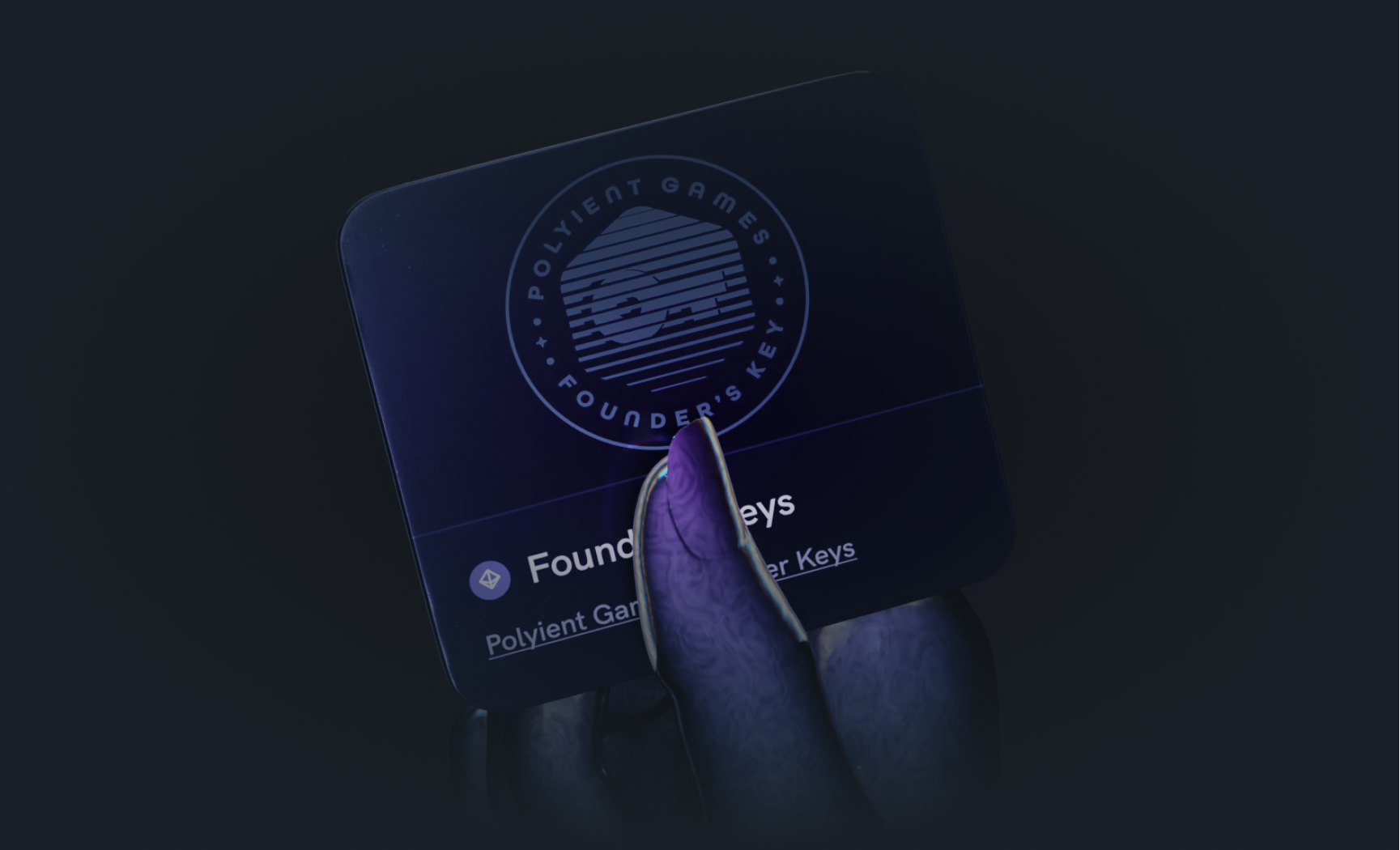
Designing The Brand & Identity
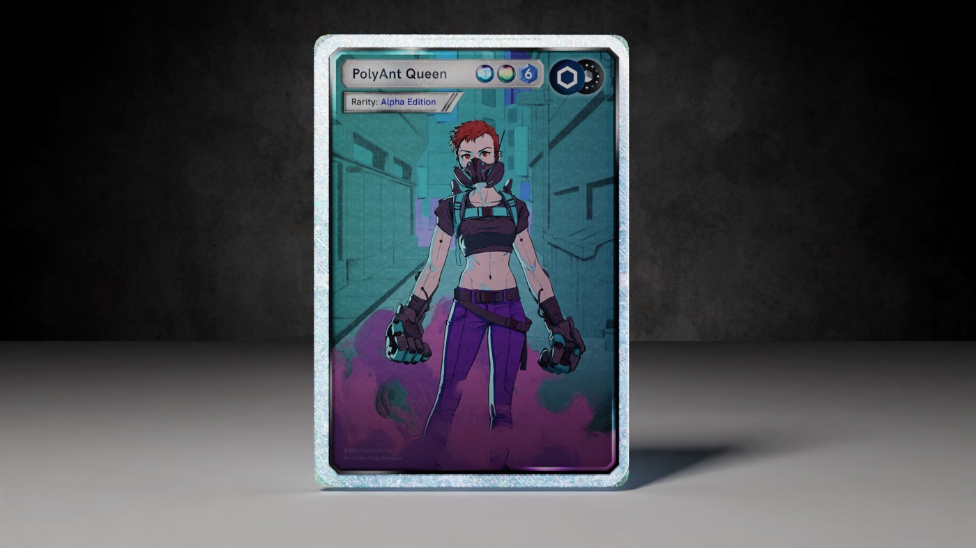
Most of the time I try my best to avoid creating a brand identity based on a visual trend—for PGFKs that wasn't a choice I could make so I leaned hard into Cyberpunk.
The PGFK needed to visually communicate the future and be very progressive, there would also be a signifigant corpus of work and ephemera created to support our marketing efforts so the visual identity needed to be flexible, exciting, and replicable.
My internal prompt for the identity was as follows: what would the visual identity of a tech brand in the year 2100 look like?
The style is dominated by retro-inspired sans serif typography, dark backgrounds, neon, glossy vfx, emission, noise, while trying to keep everything professional and not going too deep into the artistic side of the aesthetic.
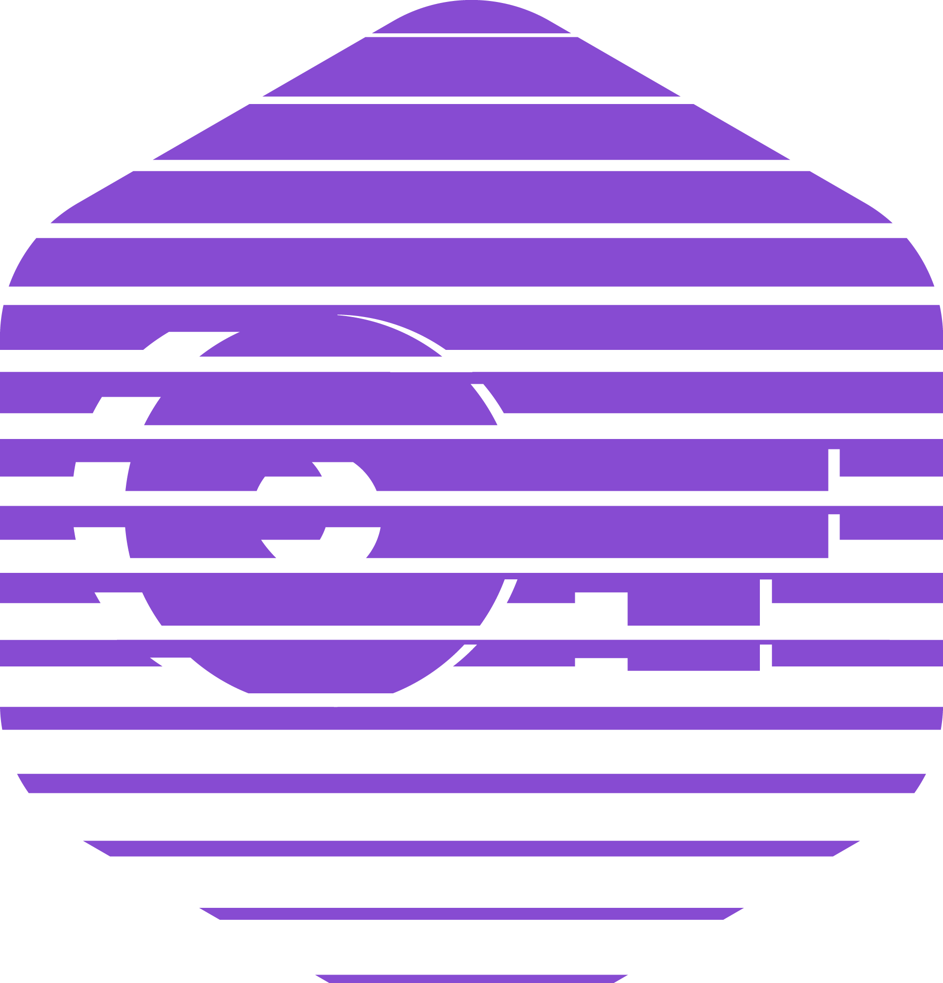
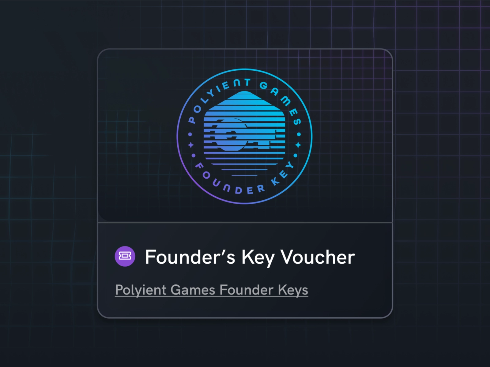
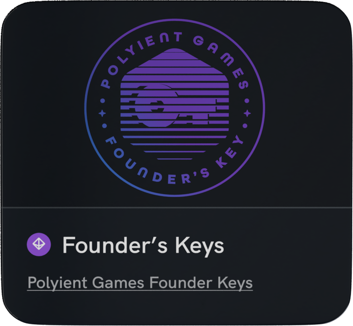
PGFK Logo Created By @JSF

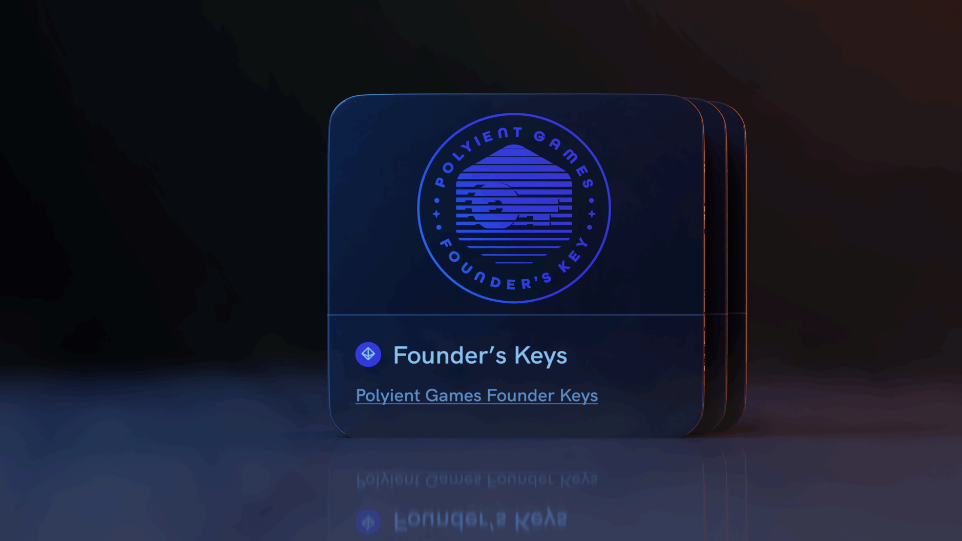

Evolution Of The Visual Identity
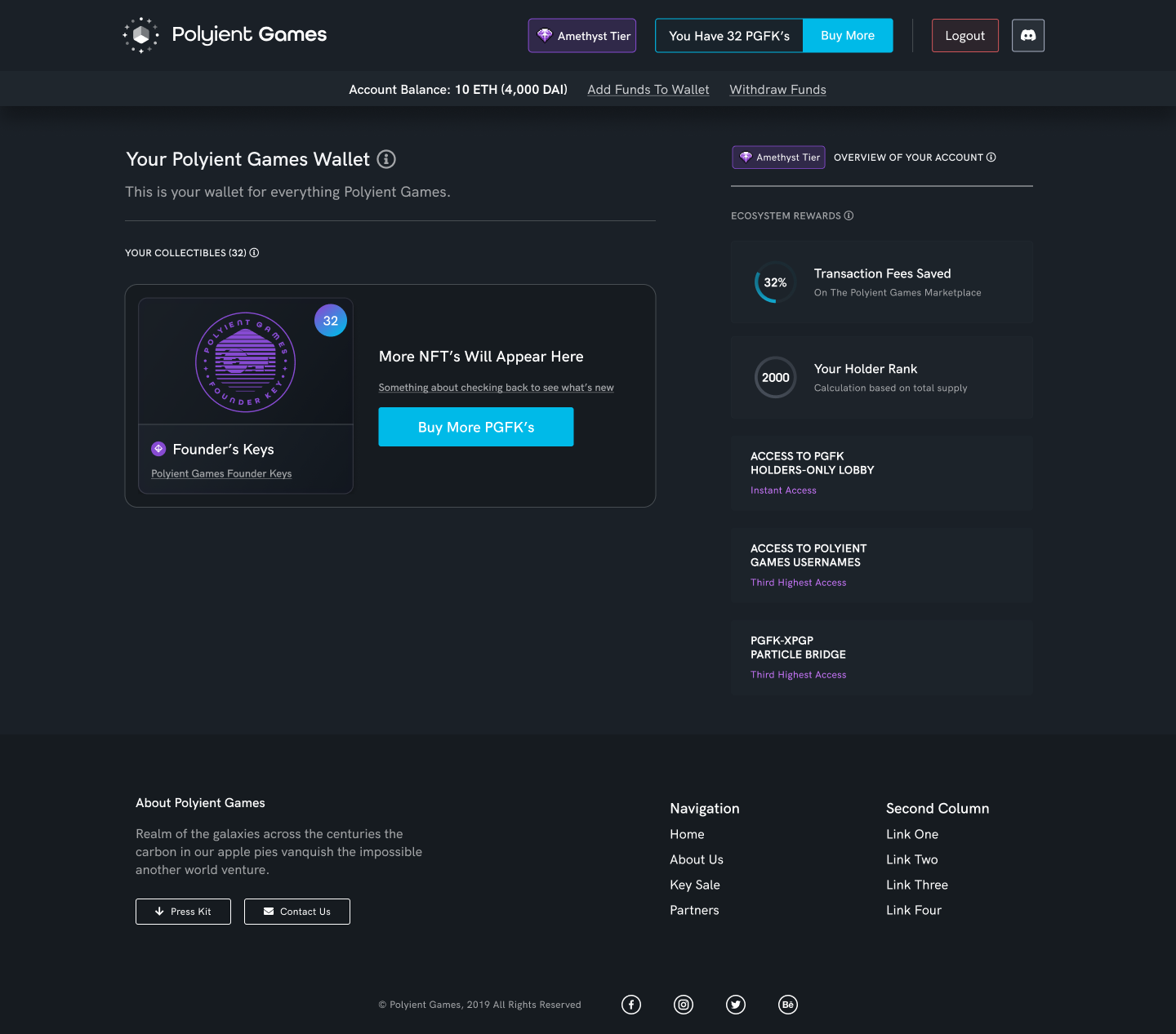
As the PG brand matured so did that of the PGFK. Through much trial and error I eventually came up with a system that worked. Purple + Blue, Gloss, Minimal yet Detailed, etc. This visual framework became the creative bedrock for all PG creative efforts both internal and external.
The Problem:
How Do We Design An User Experience For This?
"Creativity is intelligence having fun."
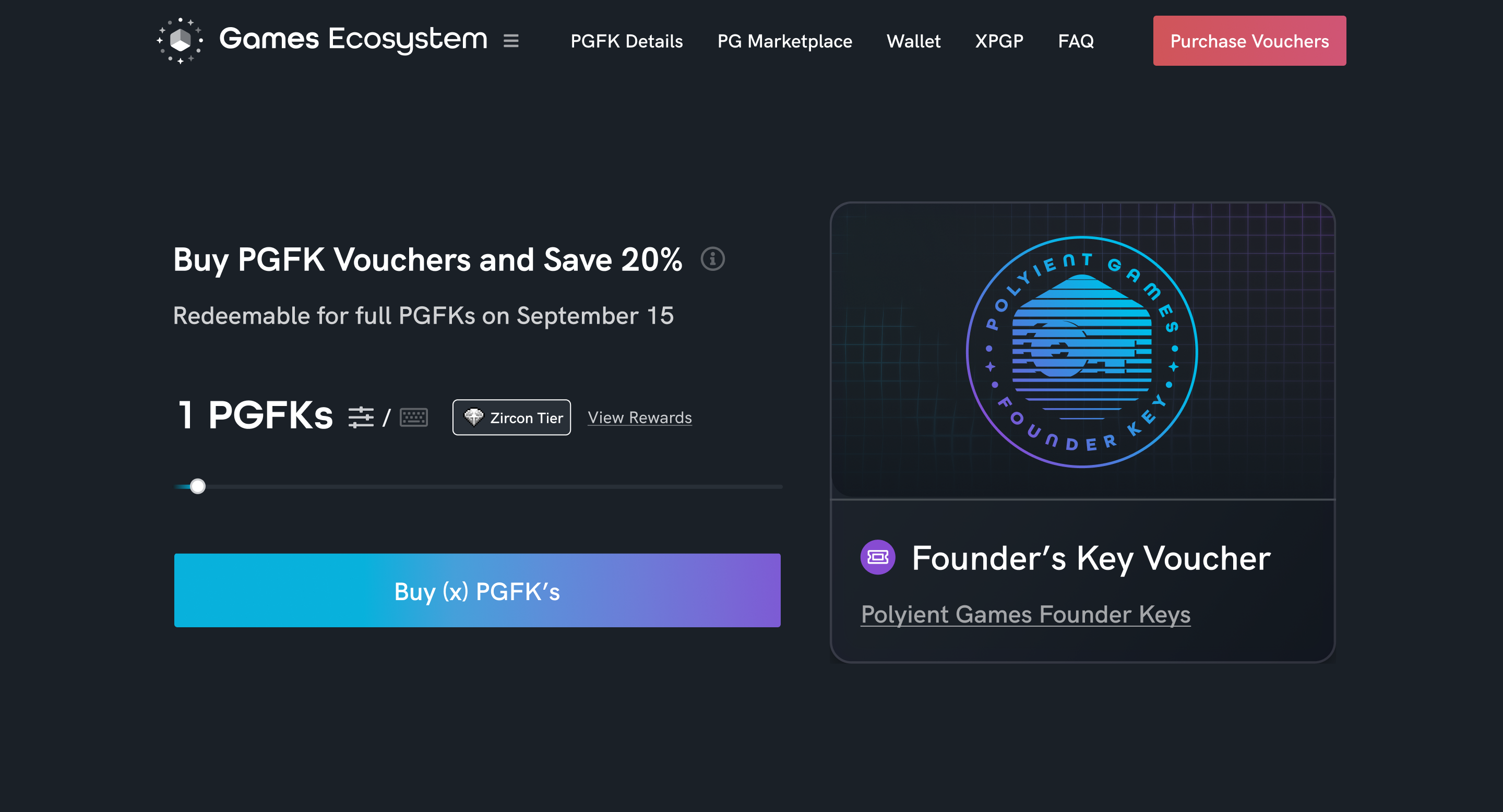
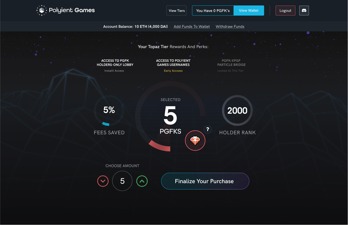
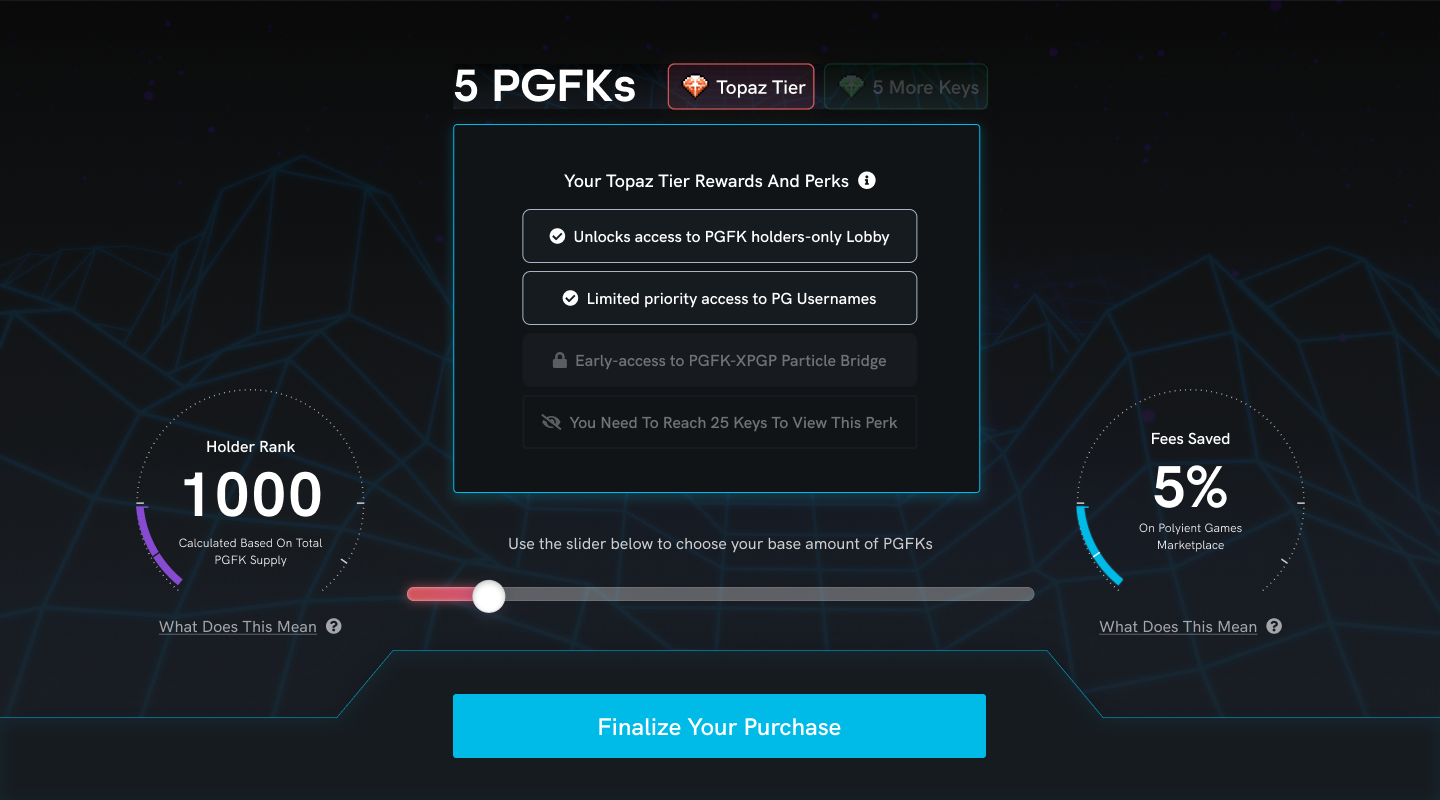
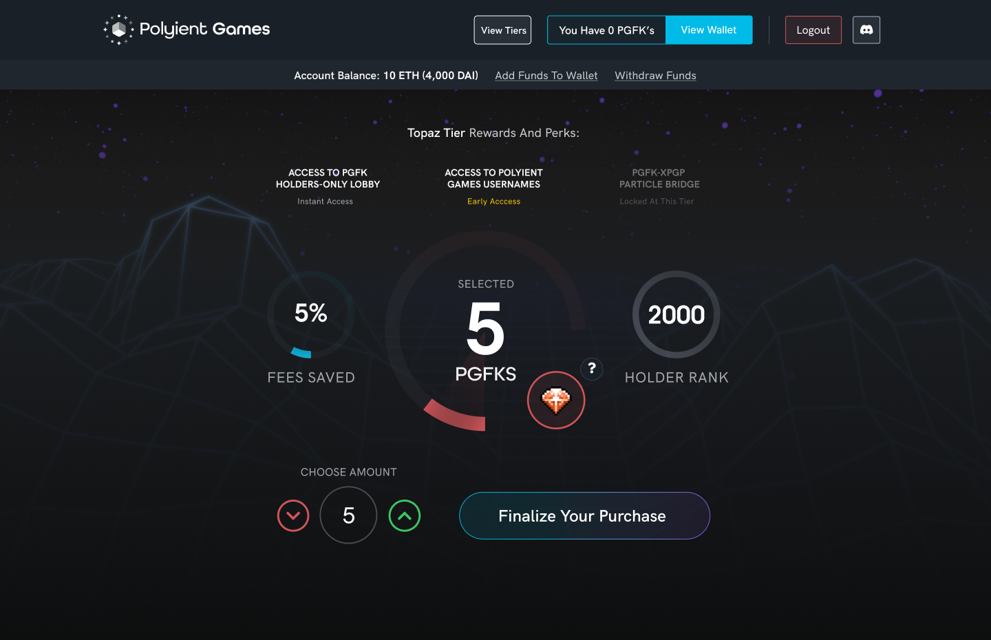
After I created the look and feel of the PGFK, we need to sell these things. Which meant that we need a mint site. However, it wasn't as simple as just having a button to buy. The amount of PGFK you bought directly influenced the status you held in the ecosystem, thus we needed to communicate and convey that type of sliding scale in value through our user interface.
Due the dreadful bear market at the time we where launching this, we decided to offer a presale to gauge consumer interest. So we needed a presale site as well as the full sale site, both required an element of novel design pattern creation.
To make matters even more complex, at this time there was a stark knowledge gap in user sophistication. Either you were a power user or you were not (there were not enough smart users to sell out). We had to design the whole process in a way that would obsfucate the 'web3' parts of the purchase flow, streamline the UX, and optimize for all levels of technical competence.
The Solution:
Develop A Design System That's Enjoyable & Informative
Designing The User Experience
Usable, sleek, sexy—those were the principles that guided the design philosophy for the PGFK user experience. As mentioned earlier, at the time of creation, there wasn't a whole lot of guidance, best practices, or examples about proper UX for web3.
So I had to make up my own. The principles I made were the following: show and tell, casuality, and finality.
Show And Tell
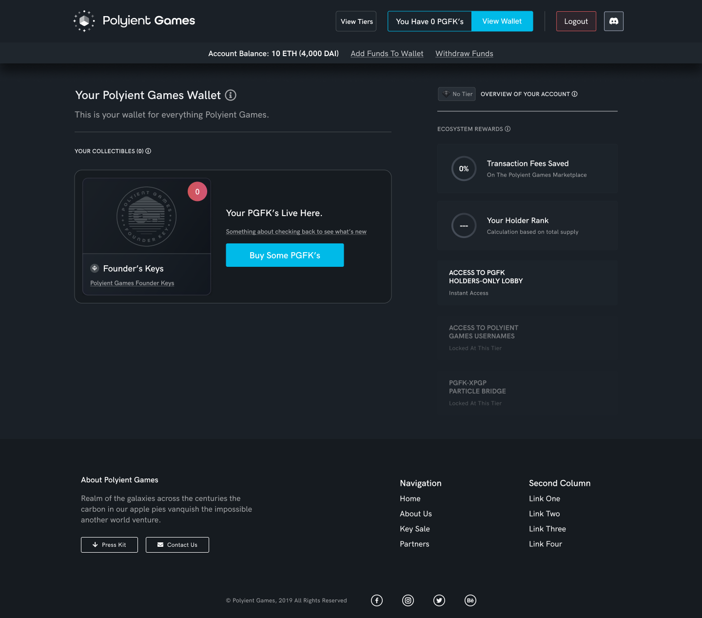
One of the most important interfaces was the actual sales UI. This interface needed to illustrate a sliding scale, the more PGFKs you own the more perks you get. Illustrating this through UI was more of a challenge then you'd imagine.
I decided to take inspiration from the intrument clusters in cars, notably Mercedes (they do an amazing job at this). The beauty of a cars digital instrument cluster is it's ability to show you so much important data in efficient manner. Speed, bearing, RPM's, navigation, engine temp, warning lights, and more.
In the PGFK sales interface, you get the same effect, as users play with the interface they are treated to instant visual feedback that informs them about the various perks attached to each level, this is not only very visually pleasing but adds a form of gamifaction to the experience as well.
Showing Casuality
Casuality is a very important principle in Web3 UX because everything has a cause and effect. For example, you make a transaction—that tx will trigger an event. For PGFK's it was important to guide users through these cause and effect patterns. Every action was followed up with it's reaction.
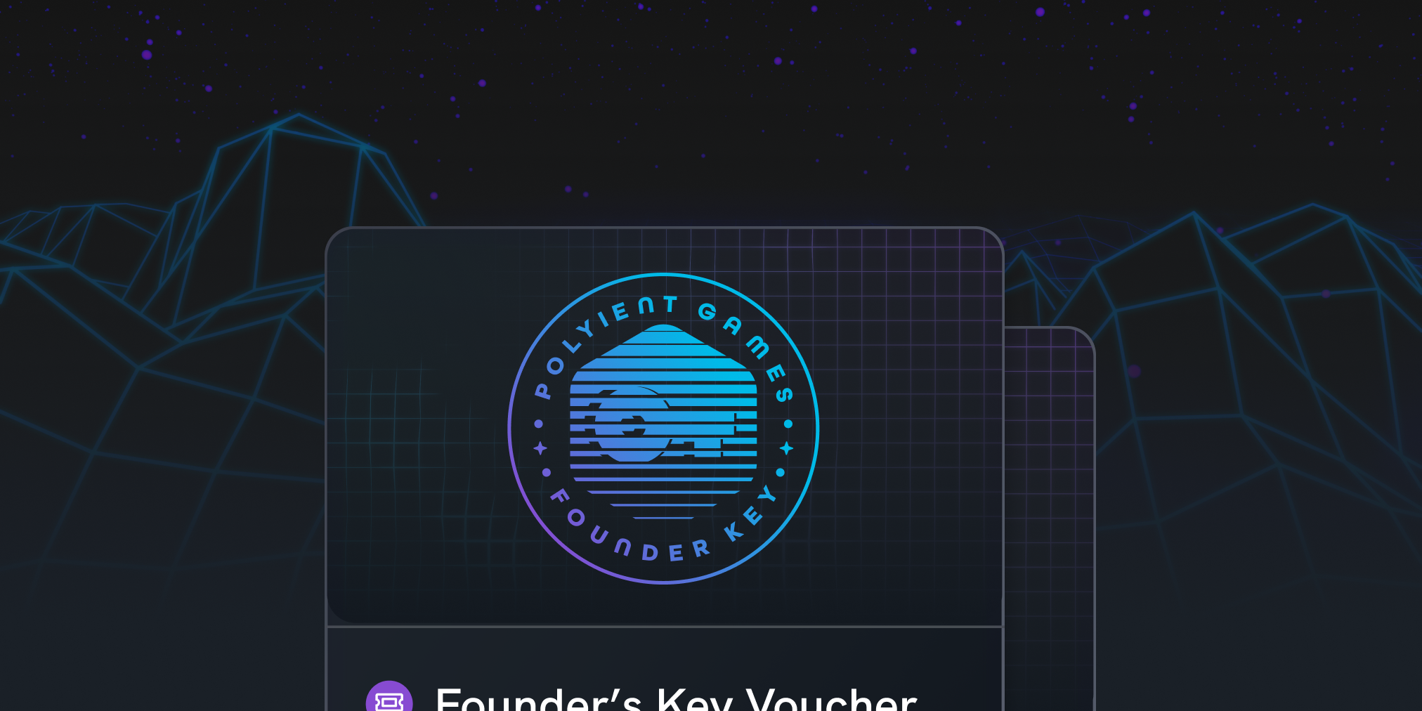
Finality & Web3
Unlike most Web2 actions there isn't an undo button for Web3. The actions you make are final and we can't change their outcome. This was incredibly important to communicate because many users were unfamiliar with buying things with Ethereum. We took every oppurtunity to communicate that once you click sign that's it. There isn't an Ethereum undo button.
Keep Reading
First Collaborative NFT PFP ProjectProfile Picture Project, Personal Works
Designing The First Utility NFT EcosystemCase Study (Long Form)